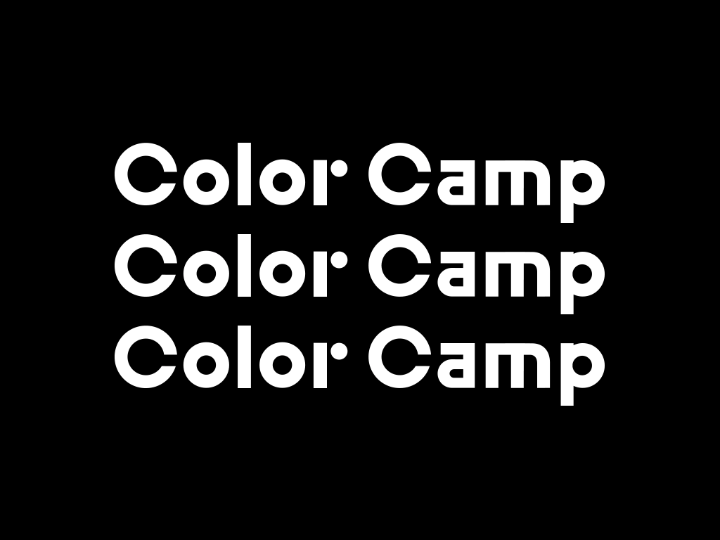
Color Camp
+ Brand Strategy
+ Visual Identity
+ Product Design
+ Spatial Design
Team
Weekday Studio
Jerome Byron-Hord
Press
Dezeen
+ Visual Identity
+ Product Design
+ Spatial Design
Team
Weekday Studio
Jerome Byron-Hord
Press
Dezeen
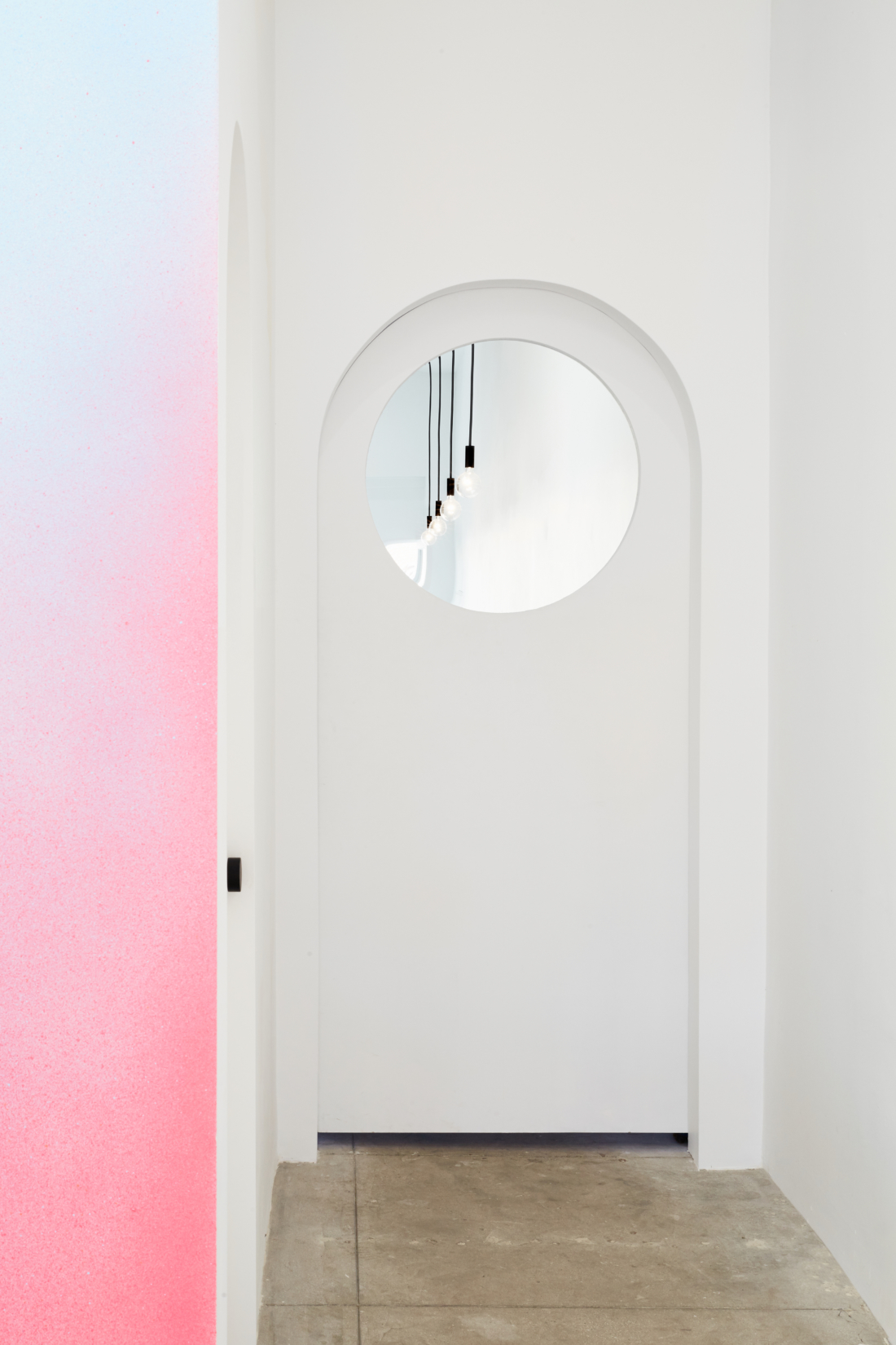
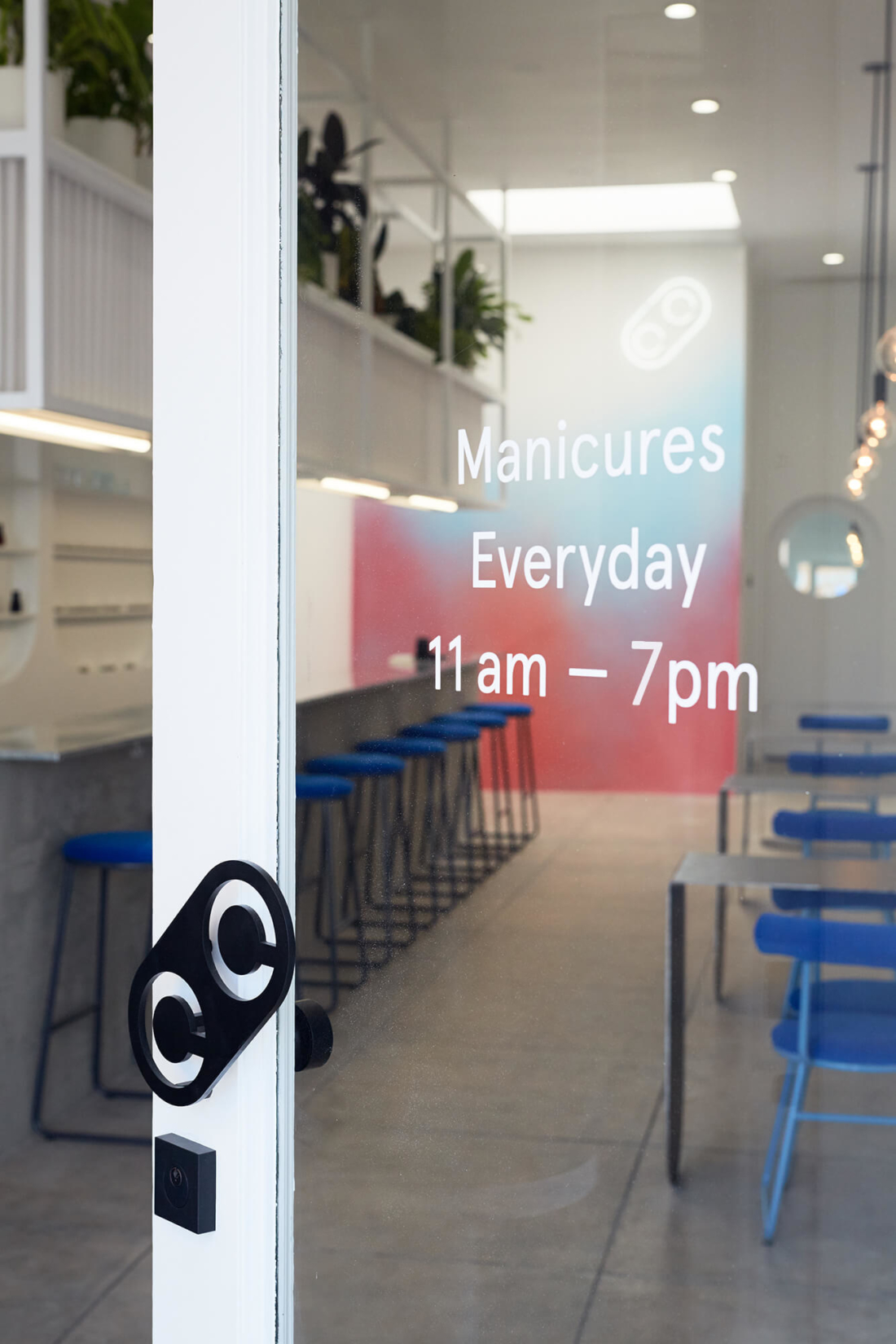
Color Camp is a manicure bar located in the Fairfax district of Los Angeles, that specializes in customizable, minimalist nail art.
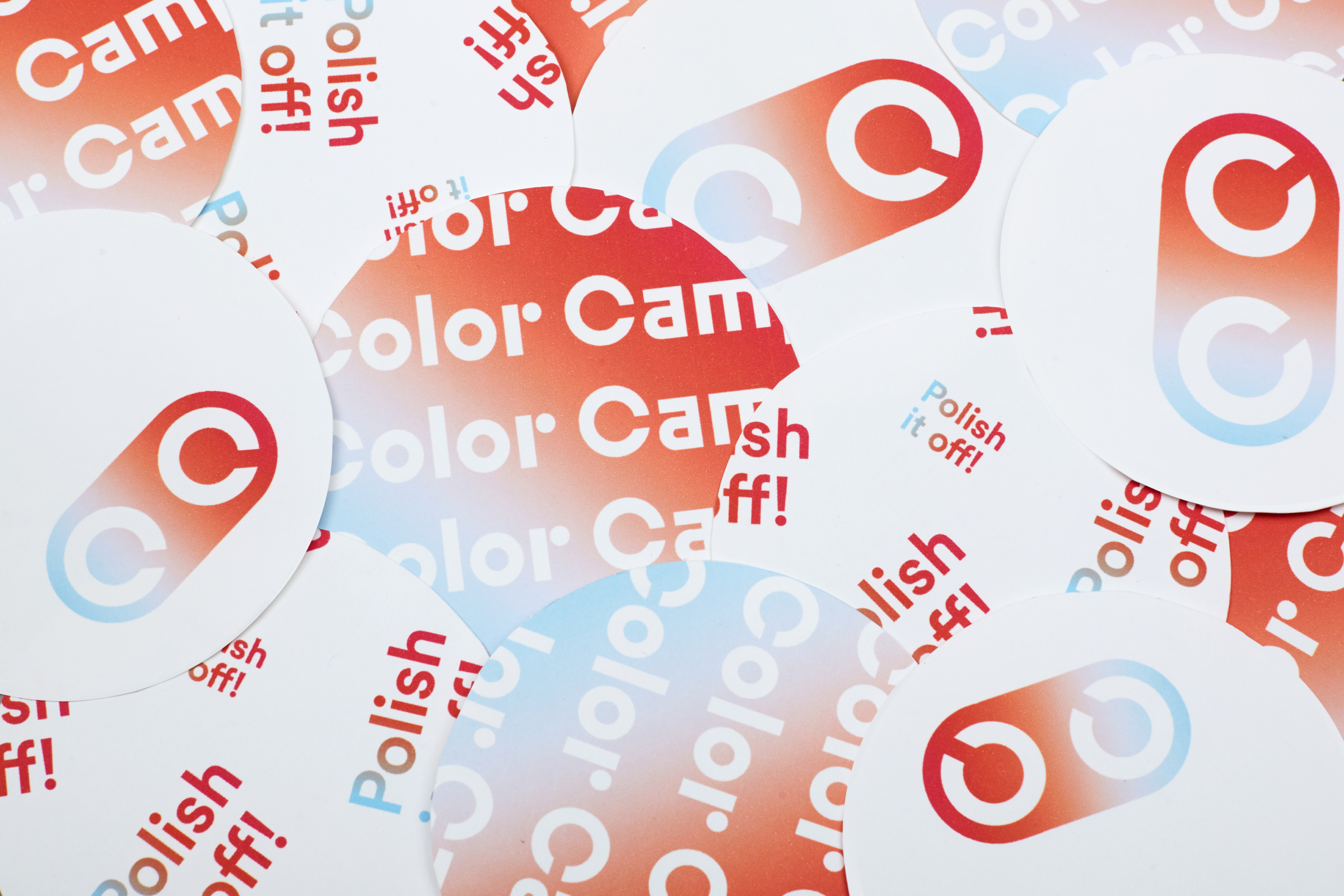
The brand strategy & visual identity for Color Camp was designed to be uniquely modern in an industry that all too often feels kitsch, cluttered and overtly feminine.
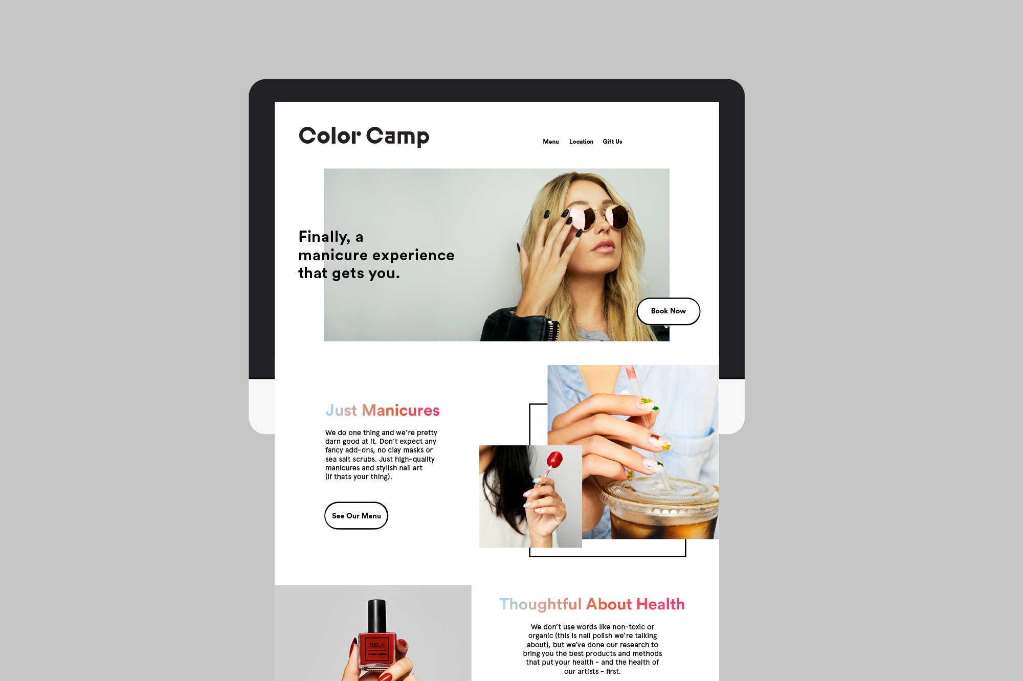
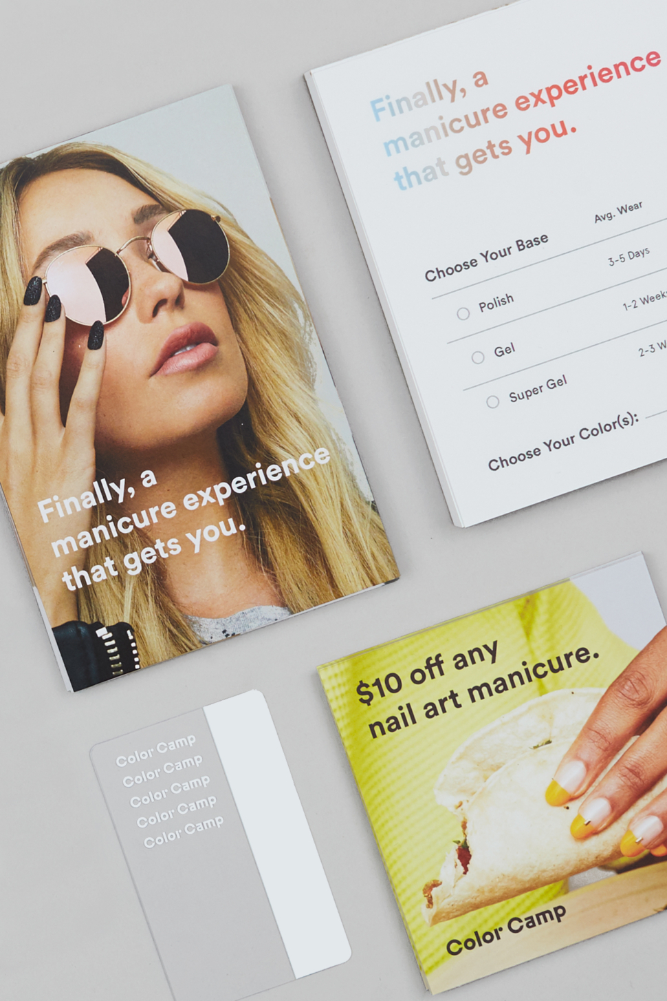
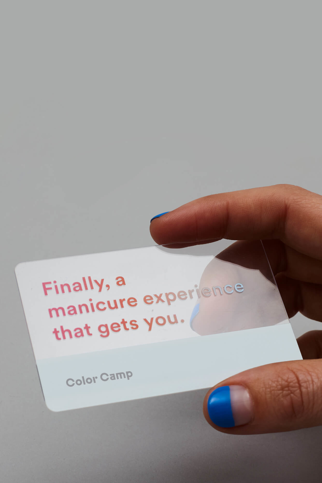
Our aim was to establish a seamless yet engaging experience for Color Camp clients, in store, online and on social media. All facets of the brand were designed to be sucessful locally, but also scalable for future growth at a national level.
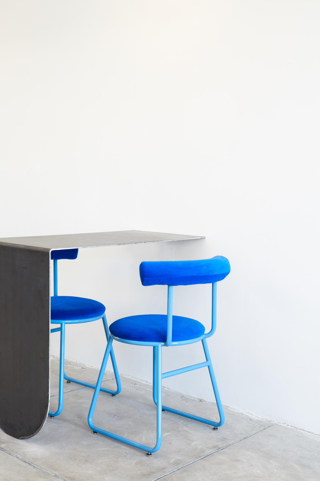
Employing minimalist forms, vibrant colors & a bold bespoke wordmark, the bright and modern aesthetic appeals to a trend conscious client base.
The visual identity for Color Camp was a Weekday Studio project, led by creative director, Nina Hans. The spatial design was done by Jerome Byron-Hord.
The brand strategy & visual identity for Color Camp was designed to be uniquely modern in an industry that all too often feels kitsch, cluttered and overtly feminine.
Our aim was to establish a seamless yet engaging experience for Color Camp clients, in store, online and on social media. All facets of the brand were designed to be sucessful locally, but also scalable for future growth at a national level.
Employing minimalist forms, vibrant colors & a bold bespoke wordmark, the bright and modern aesthetic appeals to a trend conscious client base.
The visual identity for Color Camp was a Weekday Studio project, led by creative director, Nina Hans. The spatial design was done by Jerome Byron-Hord.